Thursday, August 10, 2006
Previous Posts
- Around the theme of what I wanted to be when I gre...
- Yeah, I'm lame. I always wanted to be an artist. ...
- This is how I pictured this weeks theme. Sometime...
- One more!
- I pulled together my dribbles over the weekend and...
- ok so when I was a kid I wanted to be alot of thin...
- Alright, so after being belittled incesantly by Ry...
- Looks like I fail on the Zombie/Pirate topic. I ha...
- Nobody expects zombie mermaids! They'll just grab ...
- Hey everybody, this is my first post here, and sur...
Join the Club!


8 Comments:
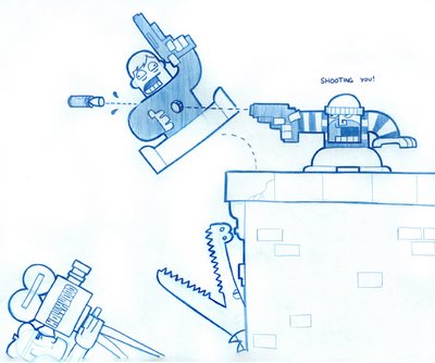
There's somethin' very 8-bitty about this even though there are no pixels and plenty of curves. Reminds me of a toy diorama.
I hope the doctors can fix this guy though. Maybe fill his hole with a cheese log or somethin' else equally healthy for the body.
I like the croc looking out his building window. I bet he has some sweet digs. People skin rugs and everything.
Very cool, ya know when i think about it I use to watch the fall guy alot when i was a youngin, and part of me wanted to be a stuntman like him too. :)
It reminds me of Kaboom, Pitfall, Keystone Capers, and Elevator Action rolled into one.
The bullet forcing out the "Tube" of body is great.
The director is going to die if the rules of gravity apply here.
I guess this was filmed before using blanks was the style.
I love the style too, but my favorite part is that he's saying "SHOOTING YOU!"
I agree that it looks very old-school videogamey; I like the style a lot! Nice touch with the cylinder of meat getting pushed out by the bullet.
Really nice approach and design. Screams for color. Good schtuffs.
Really nice approach and design. Screams for color. Good schtuffs.
Post a Comment
<< Home