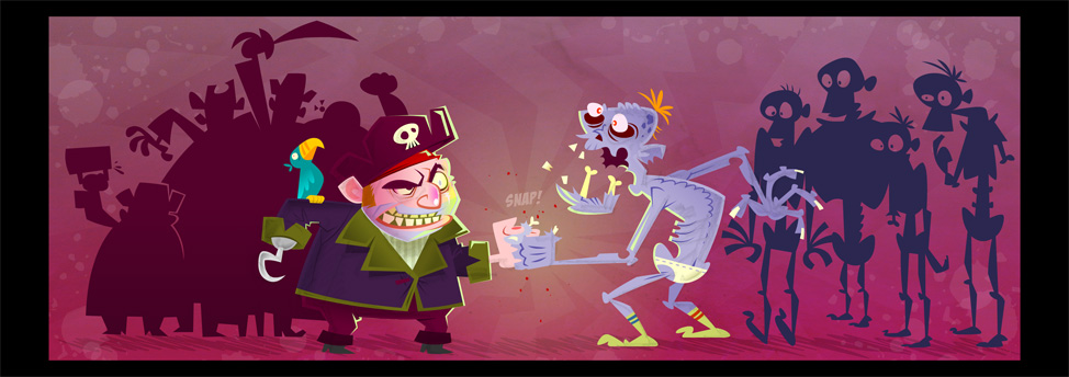
I pulled together my dribbles over the weekend and tried to polish this one off. I wanted to take the layout more horizontal so adding the background bodies helped. I had a blast with the colors even though I'm not completely satisfied with 'em. It always takes me so long to pick and choose :)
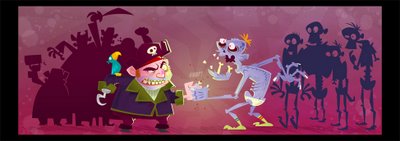
More importantly - Kurt found this picture of Ernest Borgnine that looks frighteningly similar to my pirate! Man whatta creep! Borgnine, not Kurt.

More importantly - Kurt found this picture of Ernest Borgnine that looks frighteningly similar to my pirate! Man whatta creep! Borgnine, not Kurt.

Labels: Week 01
posted by boob at 1:24 AM
![]()

8 Comments:
This comment has been removed by a blog administrator.
This comment has been removed by a blog administrator.
Here's a revised version of two posts I just removed, due to having gotten Bob's name wrong--'cause I'm an idiot who went blog-hopping before drinking his first morning coffee...
Bob, this is a helluva finish. Your palette is moody and fun, and I especially enjoy the sepia work on your "Borgnine-Pirate" (though I'll tolerate no disparagin' remarks about my man Ernie!)...
Also, is that an extreme angle on your zombie's...er...nether regions, or is he just a really gracious loser? Either way, great polish!
The finger break is so painful - it glows! The clothing on the zombie is a nice touch. I suppose zombie's get cold feet too!
Borgnine was on a Simpson's episode - Your pirate guy reminds me of that caricature definitely.
Great stuff as always!
Coming along really really nicely Bob.Like the pallette , the seperaton of color sides, and the bg texture. To spice it up a bit i would angle the skeleton with hunched shoulders backwards a bit for more dramma.Alittle more terror and reaction from all the skeleton crew would be nice too. Seperate the main pirates hat a little more with a lighter highlight so he pops more from the backing crowd. All minor. This is great.
Very nice finished piece! The crowds of pirates and zombies really add a lot. I do feel like the broken zombie thumb disappears a bit - I know you've avoided hard outlines on this one, but I think it needs a little extra something to help it stand out.
Nitpicks aside, it's definitely another winner.
Turned out great, man. Turning the zombie around definitely helped the pose. Lovin the color scheme. Nice.
nice B o B,s nice..
Post a Comment
<< Home