Head popping fun!
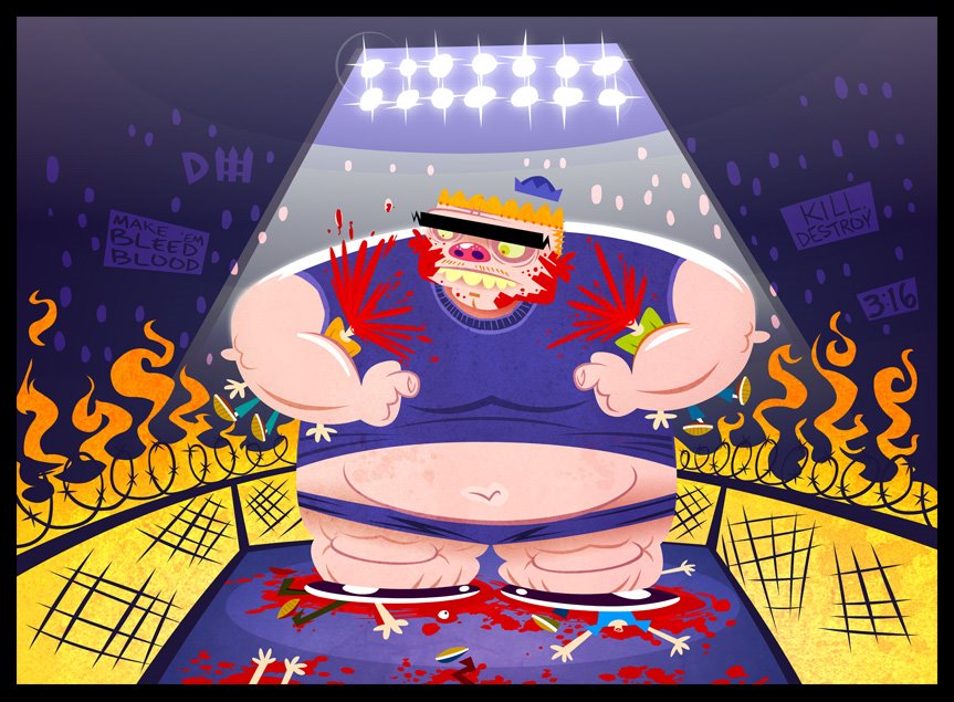
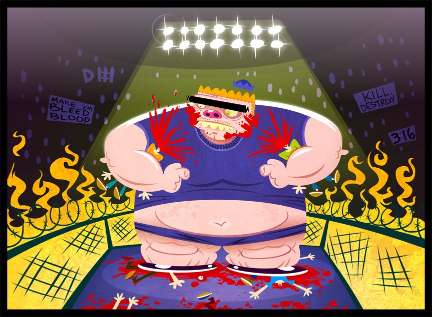
Back again. Just figured I'd add to my original post. I messed with the colors a bit more in this update. I think it's stronger now but for cop-out reasons: I didn't have a good idea of colors in my brain. Usually I have a direction I want to go or something I want to experiment with but this week I was lucky enough just to get a sketch. So the more I worked in Flash the more the colors just boiled down to oranges and purples. The contrast - I just wish I had a better mental image from the start. I also debated about the blood. I was going to tone it down - maybe erase it from the goons face. Too much? In the end I left it all - the sprays and splatters were just part of the fun so even if it weakens the image (or turns people off) it sorta represents my original drawing.
So what have we learned? Violence = fun.
---------------------------------------------------------------------------
I haven't done anything violent in some time. I dunno where the imagery came from - guess I just tried to think of some sorta fatso bully in a seedy underground cage match. The blood and various other details were part of the fun for me - I might have rushed 'em and some of the color at the top feels muddy to me. I might tweak a bit more but it's already Saturday. The Outsider Art Club will hopefully strengthen my time management skillz...
Haven't even been on the blog since last week. I'll be back to check it all out!
Labels: Week 10
posted by boob at 12:46 PM
![]()

3 Comments:
You have truly outdone yourself here, sick, demented, awesome!
First off - another great image. The boy is just my cup of tea. The olive eyes, deep pink nose, and the strong unibrow - all work perfectly together. The technique on the spotlights is impressive. Designy flames, signs in the crowd, eyeball on the ring floor - all details that make it a rich piece.
I agree that drawing these violent images is soothing to the soul somehow. I guess like playing a violent game, where you wouldn't dare cause harm to others, but you still have a form of release from life's daily tensions.
I see the battle in the colors here. The original image with the yellowish lights favored the contrast of the boy's slilhouette -most notably the hair. He pops out a little better there. The new colors help the hat pop out better. But in the end - I see a lampshade silhouette more in the purple 2nd image, and more division of boy and lights in the first. I see that the yellow light was a little dingy like you said - but I still think it worked fine. The deeper oranges are pleasing in the new one. All hard calls to make I understand.
I think that Dave covered my feelings on your character. He's one mean 'lil boy. My comments are on your background.
The simple crowd lends more focus to the boy popping other kids' heads. The overhead lighting REALLY give that feeling of a grand arena. My absolute favorite are the fence and the flames. I can almost here the theme music. The thunder of the kid stomping, the roar of the fire,....it's just all too exciting! Great job, keep it up!
Post a Comment
<< Home